PenguinDESIGN
Did you hear the one about the Penguin that flew?

If there was ever a slice of design that can take many generations back to their formative years. It is the original Penguin book design. The simple, colour coded, triptych, modernist covers that democratised the world of literature in Britain.
The story, quite literally all begins when Allen Lane was waiting on an Exeter train platform looking for something to read. All that was available was the dreary reprints of 19th century novels. Dark and dreary in design therefore not inspiring at all. It suddenly came to him that he should found a publishing house.
The proletariat demanded more than these bland looking novels. It was 1934 after all, the modernist world was afoot. He believed the public wanted visually pleasing, well designed and expertly written paperbacks. And he also believed that the democratisation would only happen if he could keep the price to sixpence each. Less than a packet of cigarettes at the time. But by minimising to hit the sixpence price point meant standardising all aspects of production including design. Which happened to be a stroke of genius. And was on the cutting edge of the modernist principles. These aesthetic principles were infiltrating Britain at the time from Germany and Switzerland.
He approached his uncle John Lane, the owner of Bodley Head Publishing House. Allen Lane’s uncle agreed to help and his vision began life as an imprint. At first republishing works of both fiction and non-fiction.
How the Penguin Name Came About
The name Penguin legend has it came from a comment from a secretary. Her name was Joan Coles. She had apparently overheard a naming meeting and all other names were rejected. She suggested Penguin as they are ‘dignified, yet 'flippant’.
On deciding the name Edward Young, a 21 year old office junior was sent to London Zoo. The mission was to draw some penguins. The sense of the start-up was rife even in those days. Young came back with many sketches and a first version was chosen. Legend again has it that Young’s only comment was ‘My God, how those bird stink’ after spending the day drawing them. That simple Penguin has gone on to have many forms over the years. From looking left, to looking right. To dancing and encircled in an orange oval which is taken from the 1946 version of the penguin and undated by Angus Hyland of Pentagram the global design studio.
Young then went on to become the designer of the first covers, not bad for an office junior, who later went on to become the Print Manager.
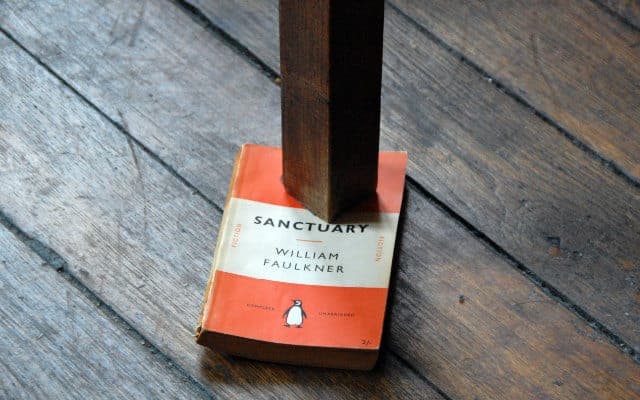
Consistent Book Design
The original horizontal tripartite division of its covers conceived by Edward Young used a very simple principle of colour and thirds. As the old saying goes ‘keep it simple stupid’ and Young did exactly that. Lane felt that illustrated book covers were trashy and vulgar. Although instantly recognisable as the same brand. The covers were very initially haphazard in design and typography, when compared at close quarters. Sometimes Gil Sans was used, which was a very modernist sans serif typeface. But also Bodoni Ultra Bold seeped in on occasions which is a faux-nineteenth-century revival typeface.
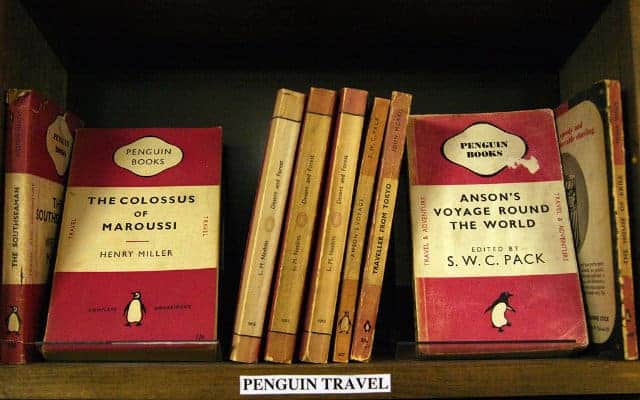
The colour coding really made the books stand out in bookstores across the land. They felt modern. And had a direct nature to them that made each subject matter and genre instantly grabable. Green for Crime, dark blue for Biography, cerise for Travel and Adventure, and red for Plays.
Jan Tschichold a German typographer who was probably the best typographer in his day joined Penguin In the 1940’s. Under his guidance and direction cemented the Penguin book design look and feel. Minimally changing the already distinguished look and feel, but adding much needed consistency. Tschichold’s rules for the look and feel are still the guiding principle that Penguin hold dear today, over 75 years later.
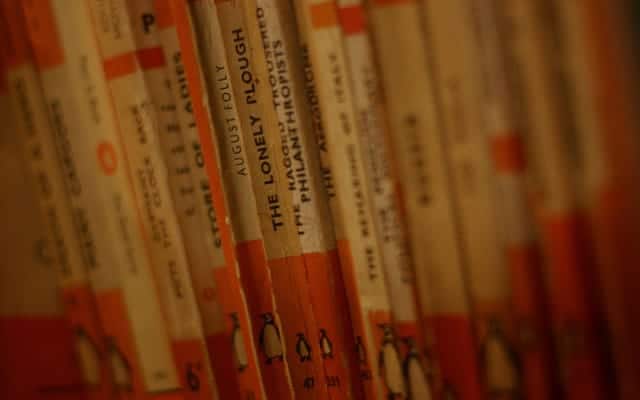

Today Penguin has merged to form Penguin Random House. No longer a wholly British concern. They sell around 800 million print, audio and e-books every year. A rather amazing ascent from that lonely platform to an absolute design classic. And that my friends, is how a Penguin learnt to fly. And how the world now loves Penguin book design.
