A-Side Artworks BEHIND THE SCENES
Music sleeve artwork too splendid to merely be a shield of what’s inside

'A-Side Design' gives Sir Gordon Bennett an insight into the making of these wonderful record cover prints. The inspiration behind them and why they make wonderful wall prints for home or office.
SGB: What first inspired you to start 45 renegade?
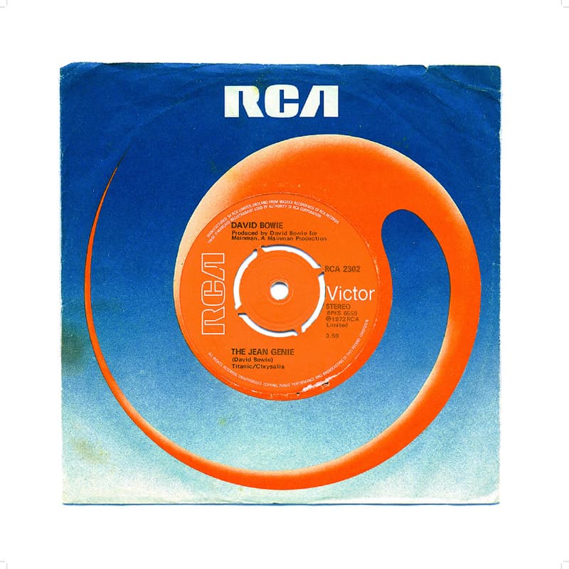
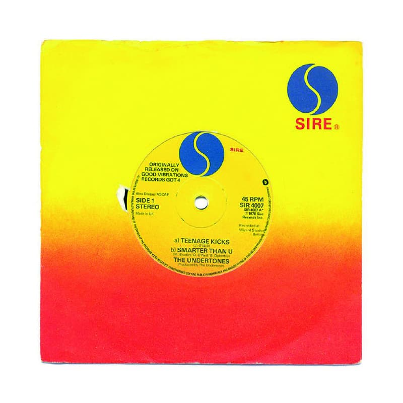
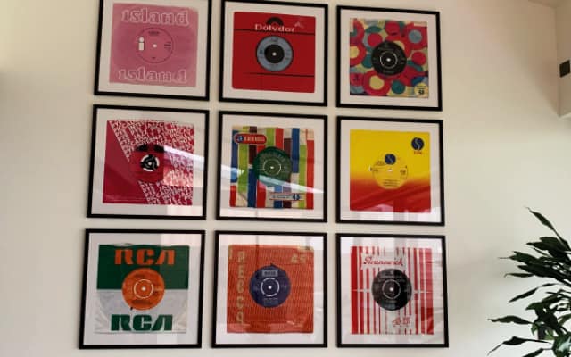
A-Side: This artisan A-Side project came about as a result displaying a few seven-inch single vinyl records on a shelf in a music room, then after much trial and error perfecting a way of increasing the scale in high resolution. This revealed the patina and exaggerated the bold colours employed by commercial artists which differentiated their products in record stores. The vinyl record paper sleeve is perhaps an accidental design classic and deserves some recognition.
Working through 7" singles it was obvious there were twenty to thirty distinct styles and colour combinations that were photogenic enough to produce a print. This series has less to do with the actual artists and labels, more the representation of this distinctive commercial art period.
SGB: How did you transfer from mere inspiration to artwork?
A-Side: The first prints produced stopped people in their tracks at the printers and then again at the framers, so the commercial potential came to life by accident really. As soon as you could see the beauty of these old record sleeves, wart and all come to life you instantly fall in love with that period of music art work.
SGB: The vinyl collection and the period is obviously the main driver in the style.
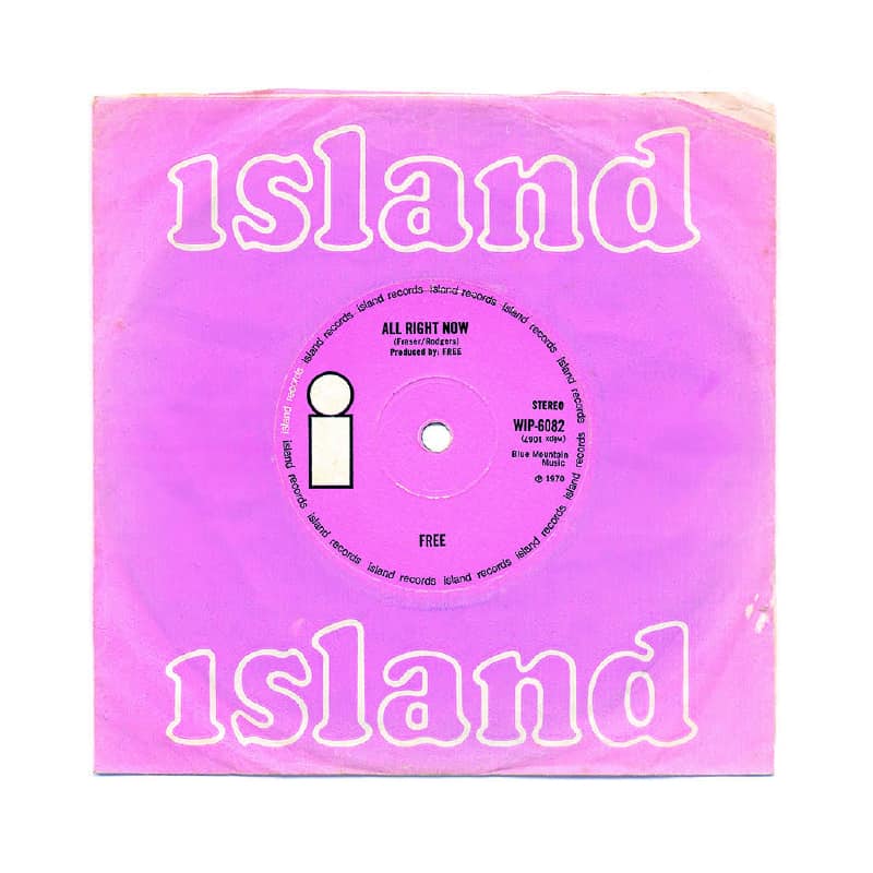
A-Side: The commercial art, fonts, colours and styles of the Sixties and Seventies have always been nostalgic to a Mid Century enthusiast. The patina, rips and tears of everyday use over several decades are vital to the art aspect of these in addition to this having a 3D-lite effect from the high definition and a little shading here and there. They’re photogenic as generally, the designers employed complementary colours. One or two have been enhanced to improve the appearance.
SGB: Quality is really important to us at SGB, can you talk us through your choice of paper for the prints?
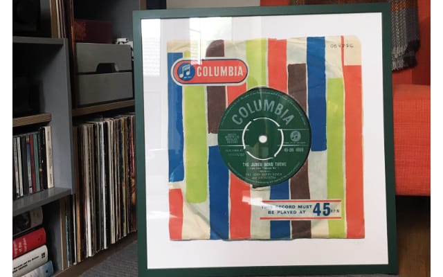
Steve: The printer used are dedicated to quality who employs ultra-modern industrial-scale Ink Jet Printers. The term Giclée applies to fine art inkjet printing and when combined with specific paper types can add little depth to the image. After experimenting, we settled on museum quality Hahnemuhle 308gsm 100% Cotton Matte Photo Rag paper and fade-resistant ink and not least because it’s beautiful quality. The prints are superbly produced and of the highest quality. Feedback from buyers has been wonderful.
SGB: Likewise, why the Giclée printing method over lithography?
Steve: Giclée printing is more accurate and creates a deeper print in the matte cotton rag paper. Offset lithography is fine for posters on card and silk sheen thinner paper, but these are far greater quality.
SGB: Where is the manufacture of your designs done and what inputs have you had in this process?
Steve: Minimal photoshop effects are added and colour balance altered slightly to bring out the beauty of the art and to enhance the patina of the designs as the beauty of the prints is their use over the last 50 years. The dog end, the scratches and slight tears. The single covers have been well thumbed so to say. The printing is done commercially on industrial quality printers in the UK.
SGB: The designs of your artwork have been around for many years so why is it important to revive these designs as artwork?
A-Side: These retro seven-inch sleeves were commonplace in the period, but over time as in the eighties and nineties picture sleeves replaced the branded ones and recently digital CD and streaming replaced everything these styles became nostalgic. Labels like Brunswick were merged into larger corporations. Maybe there will be a branded paper sleeve revival now that vinyl is outselling CDs again. Although it seems unlikely the seven-inch single will have a renaissance.
SGB: Which of the prints is a favourite and why?
A-Side: I love the All Right Now, it has a patina that has been enhanced more than the others, and you just don’t see much art in pink! That one looks amazing.
SGB: Is there anything exciting in the pipeline for A-Side?
A-Side: At the moment the focus is on bringing old 7" inch singles back to 'bigger' than life. But the retro music market has many different facets. Old gig tickets, old concert posters etc. So exploring those at a future point would be exciting. This music is so engrained in British culture, it is still a huge export to the world and keeping alive those that originally paved the way would be a great mission.

